Tout est là


Bernard Villers
Everything is there
The title of Bernard Villers’ exhibition at Irène Laub gallery is hardly a joke. Through this “mishmash” display, as he himself describes it, the octogenarian artist seems to be making a mockery of the very idea of progress, as if the ingredients that make up his Work have been together from the start and were merely unveiling themselves as the years went by.
Thus, the exhibition cheerfully mixes old and recent paintings on different supports, without hierarchy, always with the same concerns in mind: revealing colour, playing with the effects of light and transparency. In this respect, the title could just as well be an incentive to approach, to take a closer look. For the curious, it is an invitation to fearlessly confront the white cube and, for the more daring, a lesson in humility.
Indeed, the artist has embraced and made his own the minimalist vulgate: Less is more.
Creating artworks at minimal cost, using everything from household scraps (the famous “cagettes”) to industrial leftovers, he also claims to make as little effort as possible. Which, as you can imagine, is only half true. Both rigorous in its principles – inherited from constructivism, concrete art, American abstract painting and also Supports/Surfaces – and playful in its application, Bernard Villers’ work oscillates between two poles that one might say are opposites, but in fact accommodate each other quite well. Jacques Lizène, to whom we owe some clever puns, said of Villers that he is a “humorous minimalist”. His painting and publishing work have confirmed this for over fifty years.
Everything is there, but everything is not (yet) said
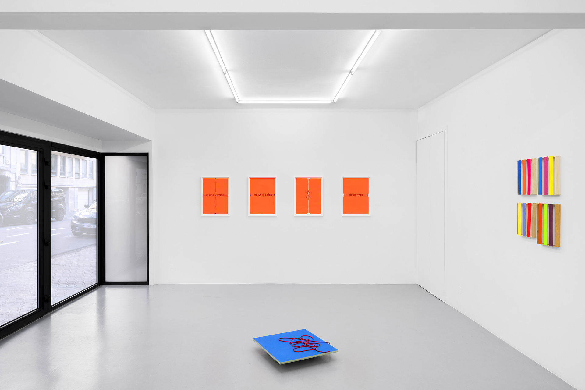
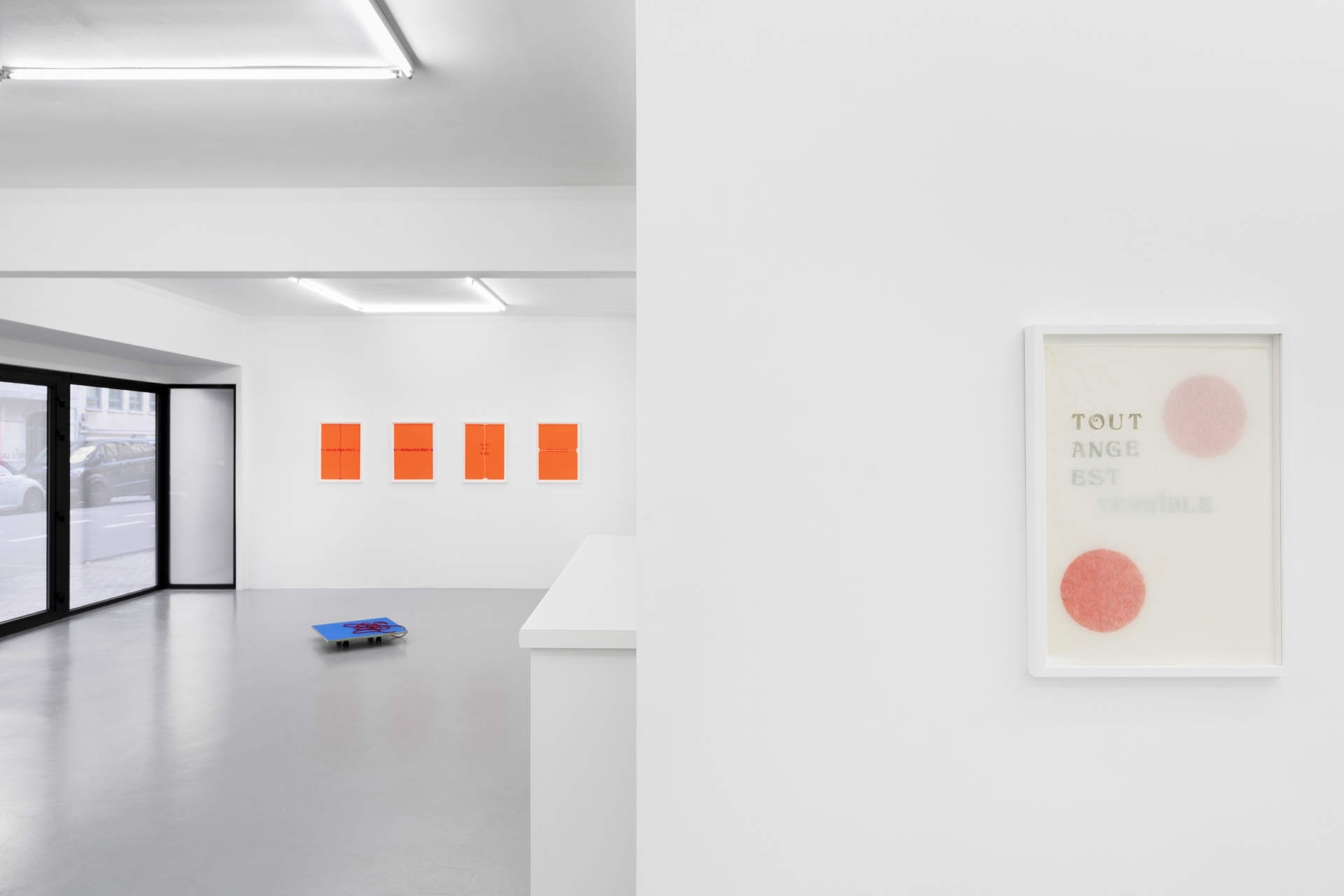
The title of the exhibition comes from a series of cut and pasted works on fluorescent orange paper.
Words are an integral part of Bernard Villers’ pictorial language: as the son of a poet, writer and literature enthusiast, the artist took his first steps as a painter in the 1960s and quickly turned to silk-screen printing to earn a living, but above all to produce work for his peers. An activist in his spare time, he also published silkscreens, a perfect medium for the political revolution that was underway at the dawn of the 1970s.
But this is not the subject of the works on display today, although they retain the memory of the past and even its imprint: the tape, clearly visible at both ends of the paper, and the tear, sometimes in the form of a cross, underline and attest to his work process made up of successive stages and displays.
As in restoration, reversibility seems to be the guiding principle. Not to leave any evidence behind would be a fault towards future generations.
The meaning of words can also be reversed, the underside can become the front and so on.
He always uses the same typography and the size does not differ, regardless of the paper format. Again, this is an inheritance: a printing font that belonged to the artist’s father.
Persistant images
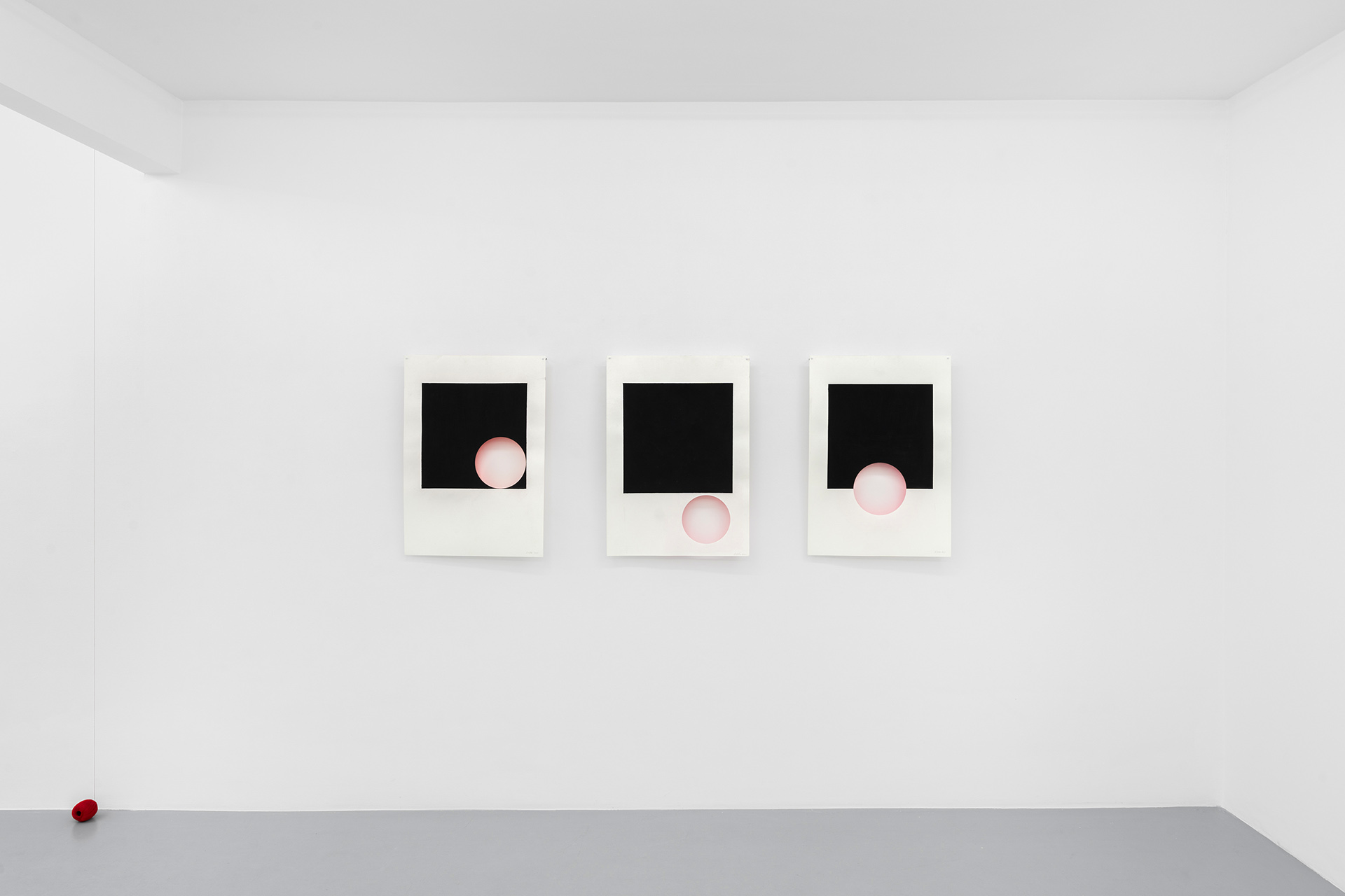
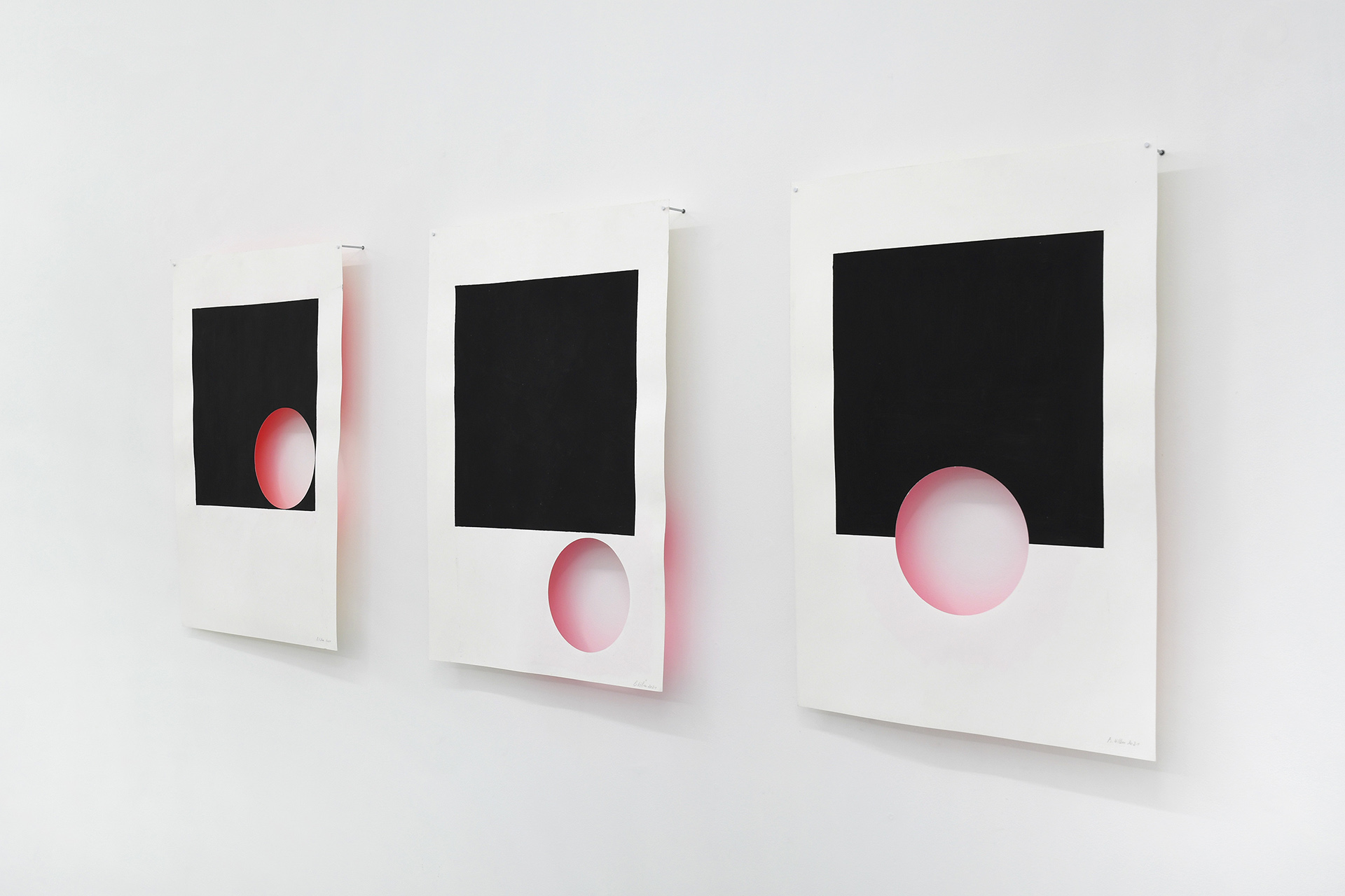
Of course, the technique always influences the practice in some way. Flat surfaces of colour and geometric shapes appear thanks to silk-screen printing and allow for rigorous compositions. Bernard Villers gradually emancipated himself from «well done» painting – that is to say, well applied – in order to focus on the qualities of paint as a medium and its «retinal» effects. The phenomenon of retinal persistence, which was widely exploited in optical art from the 1960s onwards, fascinated him and prompted him to create works that play with the viewer’s perception. This is particularly true of a series of works that project their coloured background onto the wall.
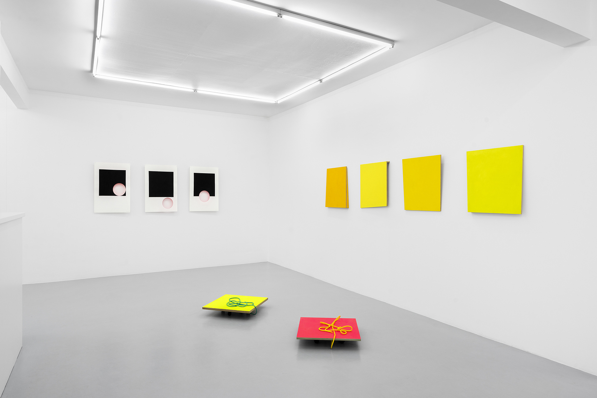
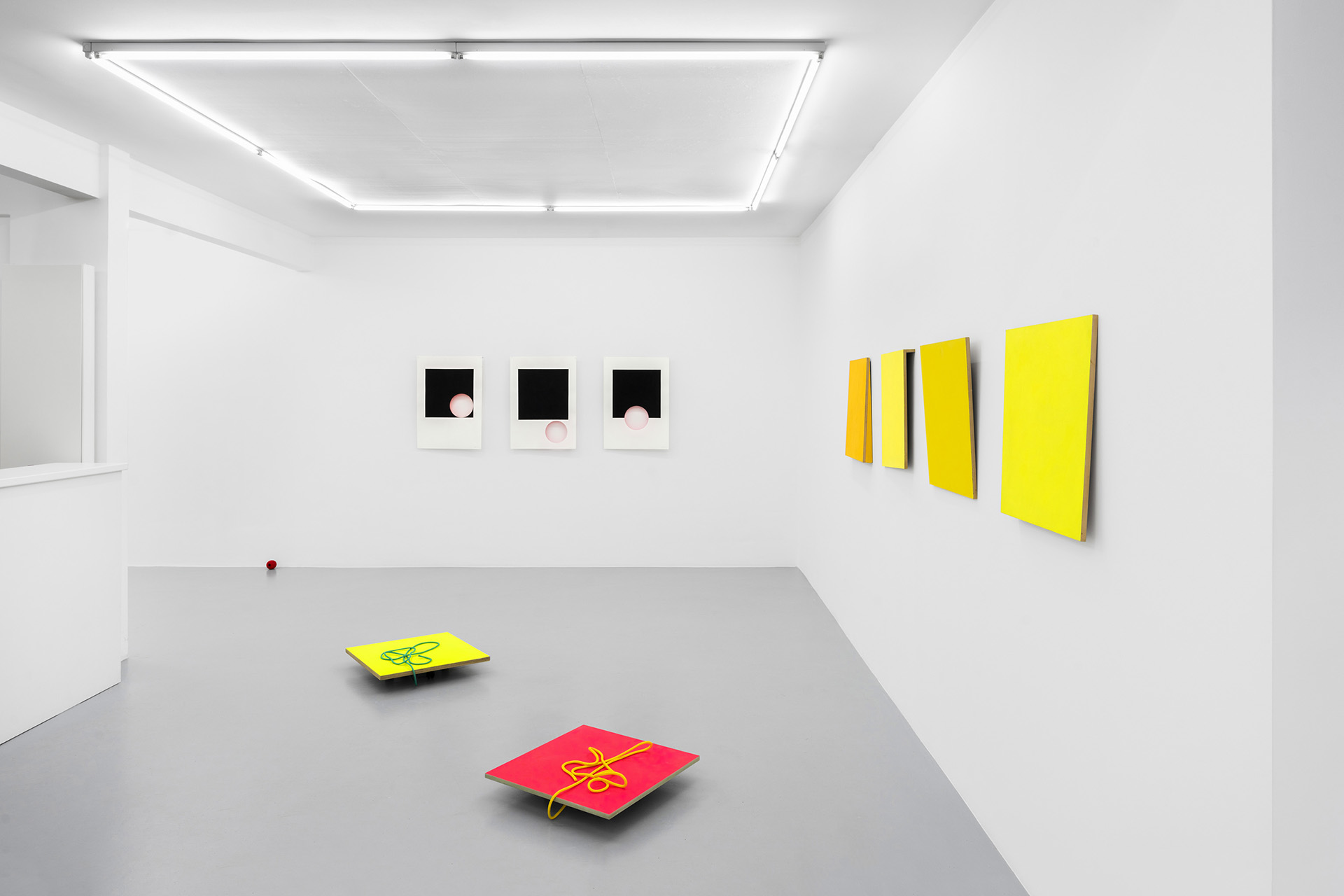
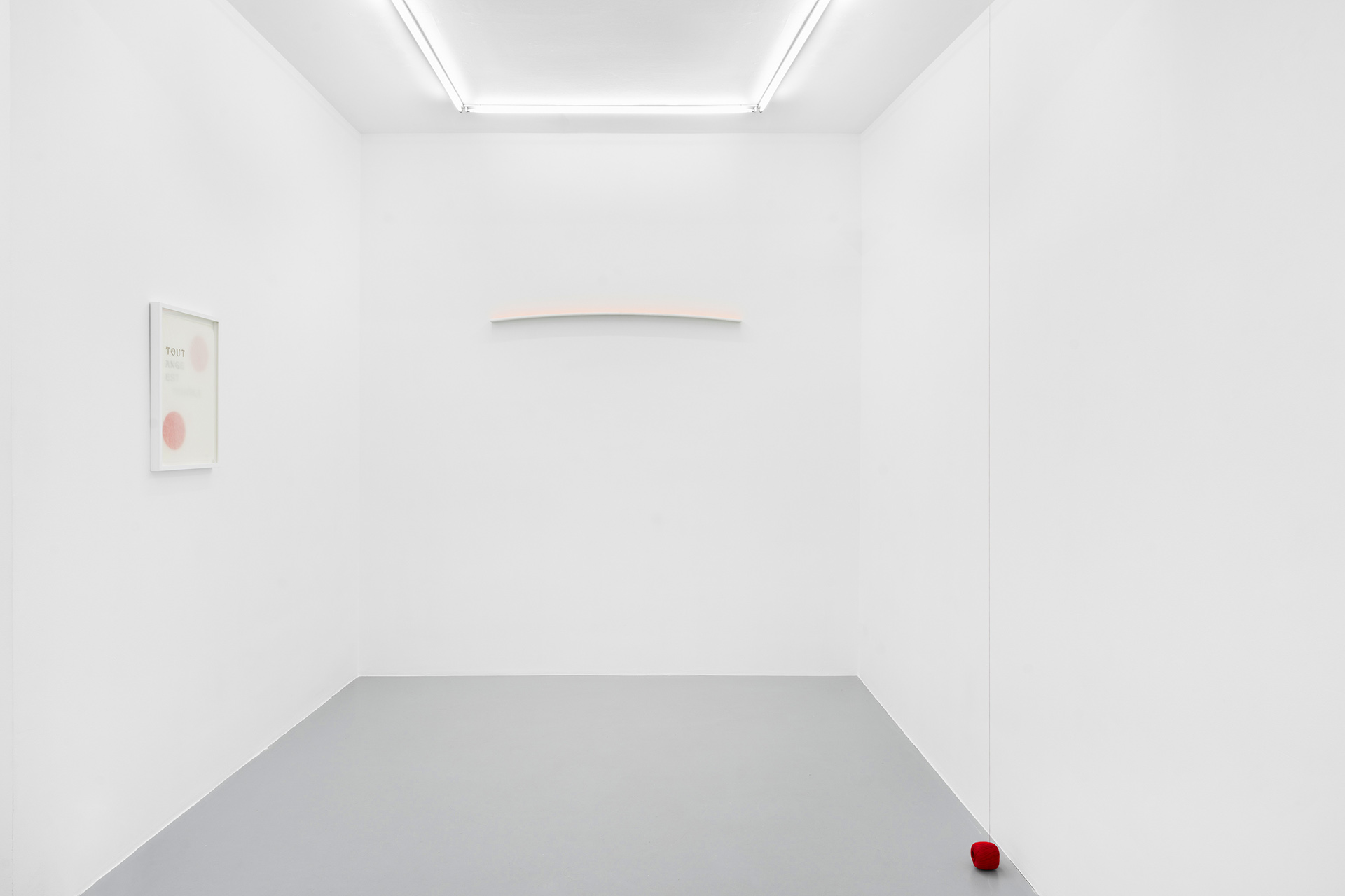
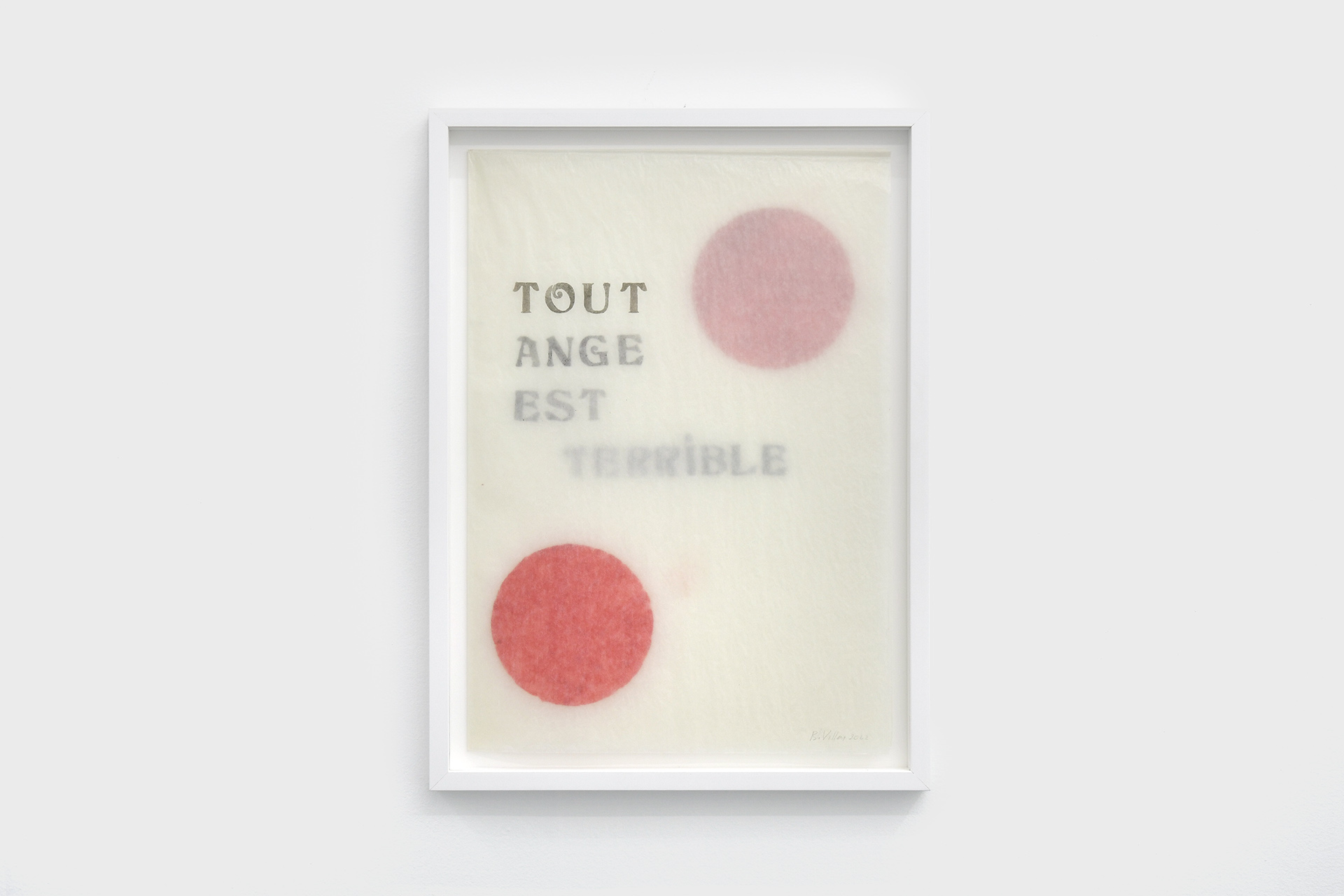
In the exhibition, there are a few examples of this, such as a series of works on paper that feature a black rectangle and a cut-out circle, whose position within the paper varies, allowing our eye to play with the gaps and integrate the afterimage into the compositions. Another example is the beautiful curvature of the horizon that marks the climax of the exhibition. A simple wooden beam is painted white and its upper part is coated with orange pigment, producing a gradation of colour worthy of the most beautiful sunset when reflected on the wall. In a different register, another work is created by a folded sheet of tracing paper, making Rainer Maria Rilke’s phrase Every angel is terrible appear with different degrees of transparency, highlighting the simplicity and ingenuity of the gesture. In another register, the work of folding on tracing paper, revealing Rainer Maria Rilke’s phrase «Every angel is terrible» with different degrees of transparency, also allows us to appreciate the simplicity and ingenuity of the gesture. The discursive reversal often corresponds to a conceptual twist. A sign of the great mastery of the artist, who spends as much time, if not more, conceiving and observing as he does in creating. «It is in this that every angel is terrible. You have to measure yourself against a perfection that is fully developed and complete, to face an accomplishment without the slightest flaw.»2
Variation on the same theme
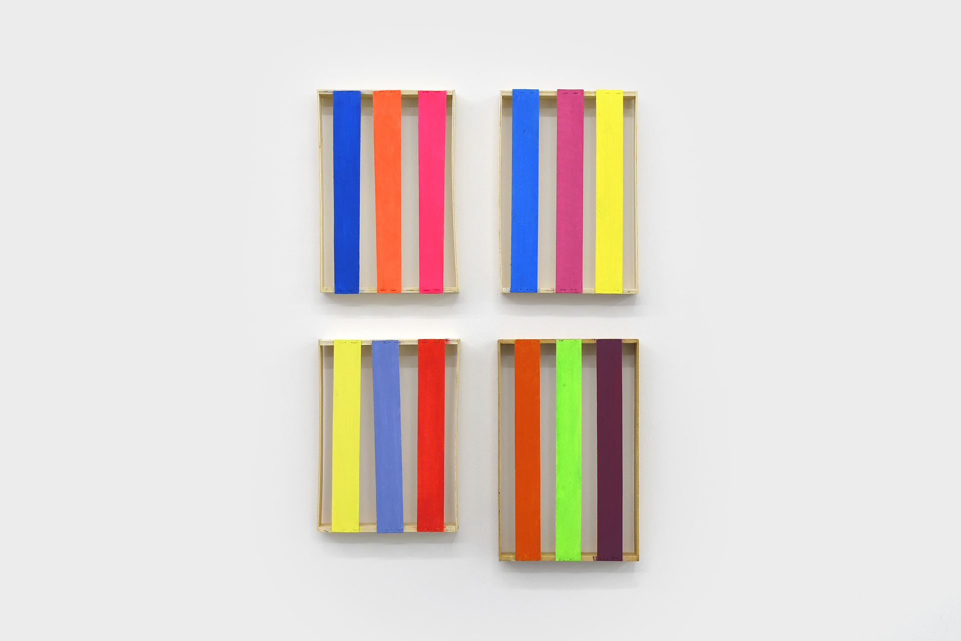
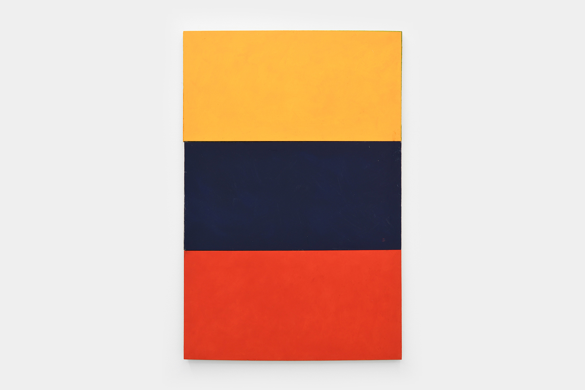
But if we were to search for the origin of this exhibition, we would have to look at the gallery’s window overlooking the street. It features a series of five paintings on wooden panels in the colours of the Belgian flag. During a visit to the studio, the artist confided to me: «For a long time I preferred the French flag colours, in terms of harmony and balance, but I ended up appreciating the relationship between the Belgian flag colours, which is less obvious. Indeed, for Bernard Villers, colour does not exist on its own: it is always in relation to another, which means that it is received differently depending on the context in which it is presented. By experimenting with different shades of light yellow to orange, by darkening the red and by changing the position of the stripes, which have become horizontal, the artist creates a rhythm, a musicality that escapes the initial reference and any form of devotion or nationalist sentiment. 3
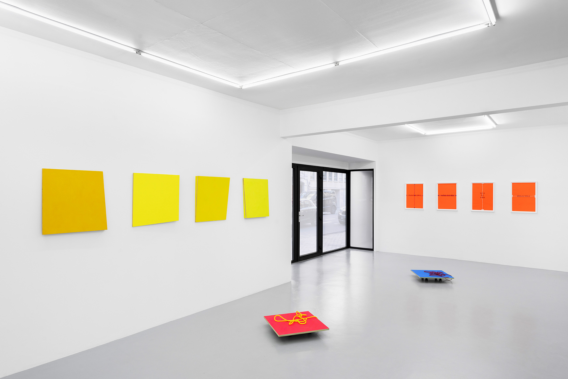
In addition to questioning his relationship to painting and the history of the monochrome, a series of oils on wood also introduces an important notion, the importance of the painted surface. The irregularly sized panels are the result of assembled wood cuttings. This is noticeable when one looks closely at the edge, which has deliberately not been painted. The randomness with which the artist likes to compose plays an important role in his painting and could easily serve as a guideline for his entire Work.
The predilection for randomness
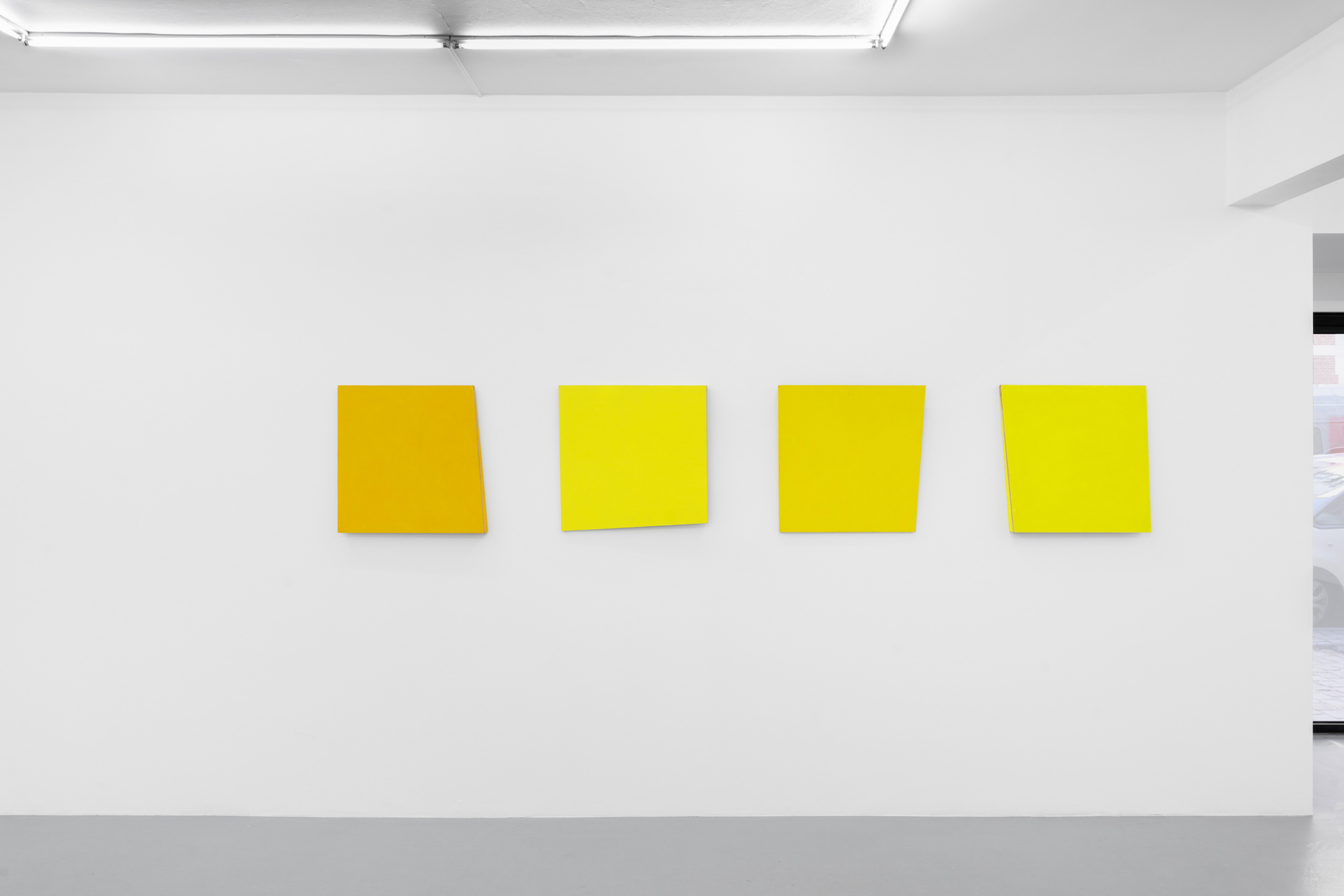
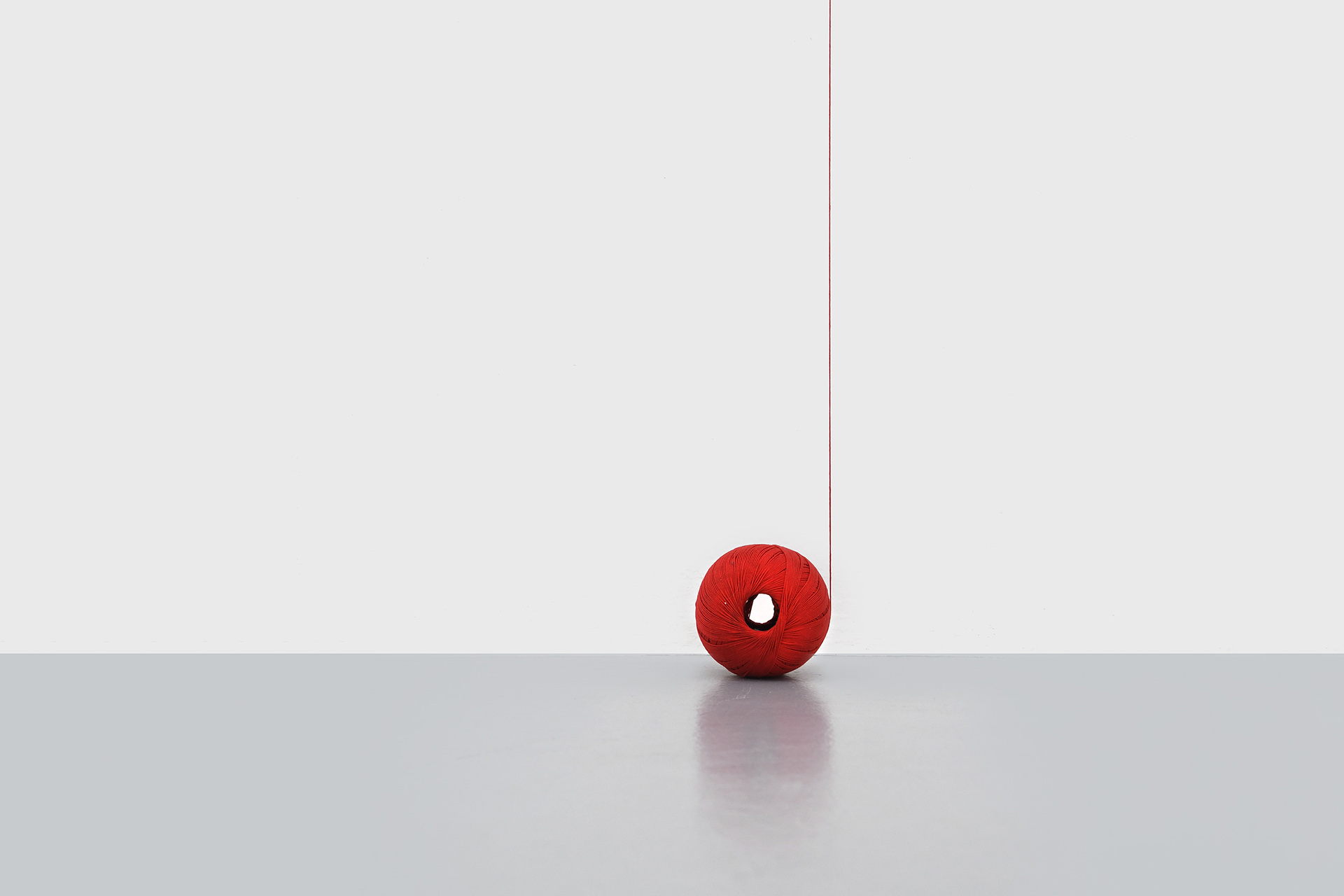
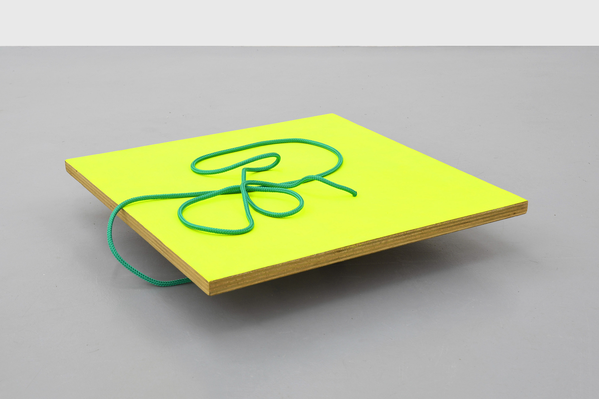
Two other series in the exhibition attest to this pronounced taste for chance. The first is a classic wall display, consisting of four monochrome wooden panels painted in different shades of yellow. But these are not flat, as one of the edges has been cut and folded at an angle. The story goes that the artist saw a wooden panel hanged askew and realised that this accident was in fact an interesting discovery. Thus, when looking at the colour from one angle and then another, the viewer can perceive a slight difference in tone. In the same spirit, Bernard Villers places panels on wheels on the floor, connected to a rope that the visitor can pull, like walking a dog on a leash. The idea is that by moving from one place to another in the space, the paintings can be appreciated differently according to the chance proximity thus provoked.
As you can see, chronology has little place in this display, which gives the spotlight to the artist’s obsession with the materialisation of a desire that has remained unfulfilled until now: to capture colour, in all its elusive nuances. That’s all there is to it.
– Septembre Tiberghien, December 2022
[The full article is published in the January edition of L’art même magazine – READ IT IN FRENCH HERE]
Footnotes:
1. In Voyons Voir, monographic publication published on the occasion of the artist’s retrospective show at the Botanique in 2018, p.22
2. Serge Venturini about « Tout ange est terrible » by Rainer Maria Rilke, éd. L’Harmattan, March 2006
3. Interestingly, however, in the first version of the flag before its adoption by the provisional government of 1830, instead of being vertical, the tricolour bands were horizontal ! Source : Wikipedia
PRESS
- Une oeuvre à la loupe, Michel Verlinden in Le Vif, 16.02.23
- Bernard Villers fait bouger les couleurs, Gilles Bechet in Mu in the City, 10.02.23
- Bernard Villers chez Irène Laub: la vie en couleurs, Jean-Marie Wynants in Le Soir / MAD, 23.01.23
- La couleur un point c’est tout, Septembre Tierghien in L’art même, 01.23
Opening Thursday 19.01.23
Exhibition 20.01 – 25.02
Location
Irène Laub Gallery
29 rue Van Eyck, 1050 Brussels (BE)
Read more about Bernard Villers